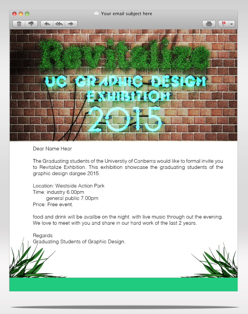
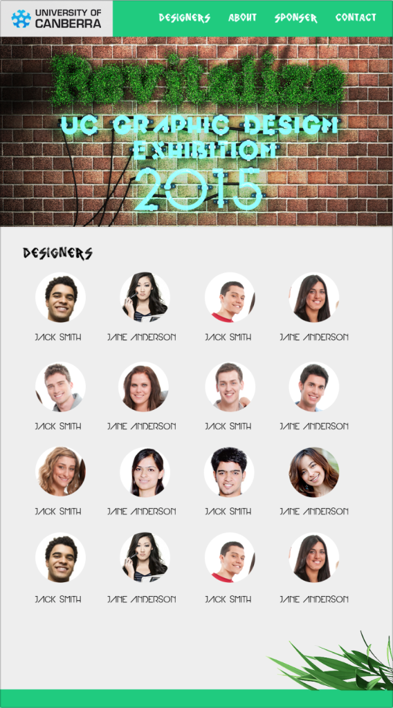
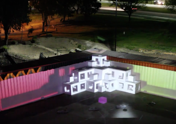
As one of the major assessments for my degree in Graphic Design we where asked to create a exhibition and brand concept for the year for year student Exhibition. and here is what I came up with.
The Pitch
Revitalize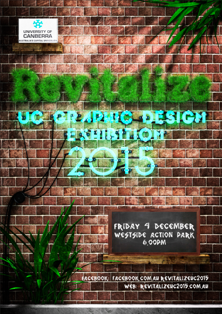
This is the name that I have come up with for the UC exhibition for 2015. The idea for the name came from the location that I have chosen. Westside Acton Park is the location that I think will work best for this exhibition. Let me break it down.
The reason that Westside was created was to showcase the new plans for Canberra Lakeside area. Westside was setup to create re-growth and change around the lakeside. It was meant to be different something that is new and mostly un-seen in Canberra. Each time I have been there it is a fresh look that has a renewed Melbourne like vibe.
This brings me to the name ’Revitalize’ simply it is a fresh look new light, hope and change. The idea that we, the graduating students of 2015 are new designers fresh faces, ready to take on the industry. I do understand that the word Revitalize is spelt in the traditional American way. I feel that this helps both the design, and helps emphasise the meaning of the word.
The Poster
Thinking on the line of Melbourne and new fresh greenery. I thought where do designers hang out and collaborate? My answer was the local cafe. New urban cafe scene was my inspiration. The idea that this poster was a display on the wall. So I mixed the neon sign with greenery of the logo. I needed a surface to write the third hierarchy of information. Naturally I thought of the chalkboard. Where you see them in cafes all the time. Whether it is today’s specials or notes to the customers. So I thought that having the secondary information put on a board that is there and out of the way. Having the plants as well to show the fresh and homely feeling of new growth.
Space
As mentioned above, Westside Acton Park would be the best venue to showcase this new wave of students that are entering the industry. The space is very important having 75 students enrolled in this unit. Each one of these students has their own unique style, we need to find a solution that helps display their work in unique ways but yet forms as one on its own. The other challenge is that the space is very vast and we need to tie it all together without having any blank space. Having a look at the images below I will hope helps make an understanding of how I plan to achieve this.
Image 1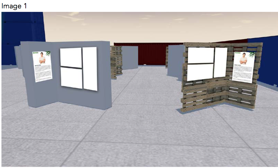
Let’s start with the display surfaces. The idea is to keep objects real, handmade and have a unique urban look. I had this idea to use palettes. This concept came from Westside itself where a lot of the furniture in the bar was made out of recycled timber palettes. So why not have the display panel made out of palettes also? Giving the students a blank space to hang up their own work gives each student their own space. I also gave the option that if their style of work did not fit with the rough organic appearance of the palettes they could have a white display board as well. These boards create a space that is just for one student, they could also work well with a table and a laptop or iMac to show that the students do more online and digital work.
Image 2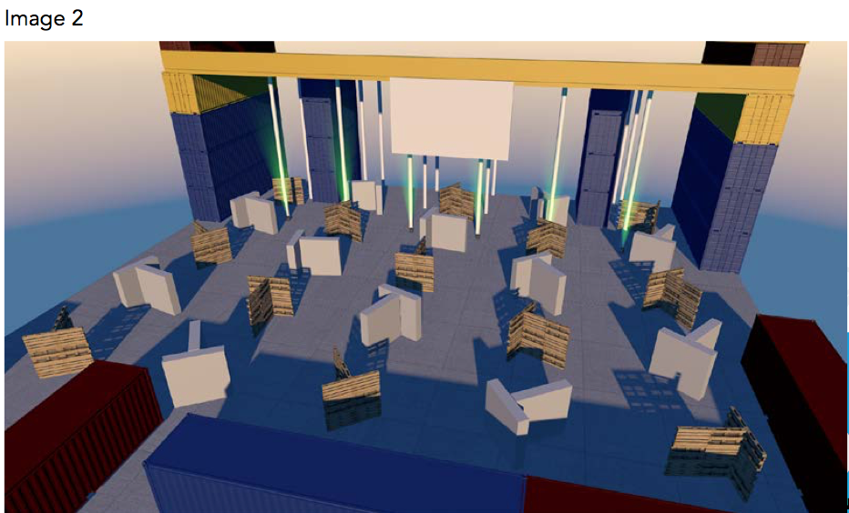
The layout of the space is also important making sure that visitors get to see not one but all the student’s displays. I came up with the idea of creating the displays in a ‘T’ Shape. This means that they are easy and quick to build and are also self-standing eliminating the need to have extra support. One side of the ‘T’ shape would be one student’s work, having in total 3 students on any individual ‘T’.
I have decided to have the student’s work being displayed down stairs in the wide-open space using the venue to its full capacity. Having the upstairs section available for use to just chill in the bar, socialise with others and any formal activities to be held up there as well.
This brings me to the point of a wet weather arrangement. Having such a large open space does not make it easy to change if there is wet weather. So I think the easiest way to make this happen is to extend the height of the display panels and have like a rain hood over the top of them.
Image 3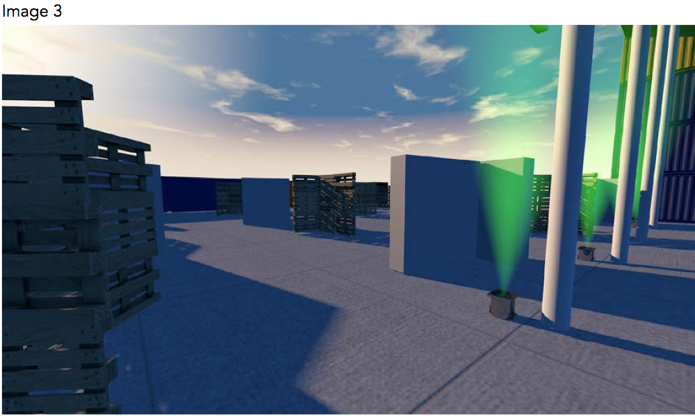
This shows the vastness of the space having three to four meters between each display. This means that people can walk around and take in each display as needed. It also means that having a large amount of people come through the space that each person is not on top of each other. Having the displays in rows just means that people can walk in whatever pattern they like to see each work. I have also added lighting to this space as well to give a wow factor and make people really enjoy the space. As we are in daylight savings time there is not much need to have much extra lighting as the late afternoon sun will be enough lighting to light each student’s works. As the night carries on there will need to be light added with both lights that Westside has mounted to the roof of its structure and each panel will have a light that is mounted on the top of the display to light each side of the ‘T’ Shape.
Image 4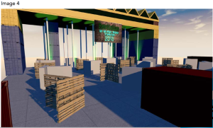
Finally another shot just to show how the space will be setup and how big it is and how the shipping containers are a part of the space. This image also shows the location of the bar located up the stairs in the big yellow section on top of the shipping containers that are stacked. I have not included the staircase in this example but they are located on the left and right side of the stacked shipping containers. There is also access for wheelchairs with a scissor lift located in the middle at the back of the Westside structure.
Another feature that I have added to the space is a large projector screen located in the middle of the Westside structure. This is the best way for students to showcase both video and photography works. We could have a slideshow that just runs through different works throughout the evening.

